I didn't think much of Mr. Sanders art back then. I was too enamored of some of the other animators work, which was very strong and solid. Chris's stuff seemed too whimsical and flimsy. His storyboards for Mulan which came out a few years later, struck me much as the Lion King ones did. A drawing of Mulan's father, revealed hands that looked like sausages with 5 tiny worms at the end. As anyone who is an artist knows, a well drawn hand is a wondrous thing to behold, and seeing the way Sanders did hands didn't endear me to his style. It was good enough for Storyboards, but clearly this guy didn't know how to draw in the Disney style and that's all that interested me.
Fast forward a couple of years and I start seeing promotional material for Lilo and Stitch. Every once in a while there is mention that the look of the film is a bit of a departure, having been styled by someone named... you guessed it, Chris Sanders. As soon as I saw some stills, I could tell instantly how well his designs had been adapted. All of the characters had large, but squinty eyes, beefy bodies, with tiny wormy fingers, or stick like claws. However, I very quickly came to like the look of the film. Perhaps it was that I needed to see the Sanders design ethic cleaned up and polished into a finished character to appreciate it, or perhaps I had simply grown as an artist. I think it's a little of both. As I learned more about my own developing style, I was finding it very hard to break out of certain conventions. When drawing a face, I resorted to standard proportions and placement almost without thinking. This resulted in drawings that were all very much the same, as each other, and as the source material I had learned them from, namely Disney films. Not only could I not make myself experiment with these proportions, it didn't even occur to me that I could. The eyes go halfway down the face- that's it! Suddenly though I was seeing Chris Sander's work, not as poor approximations of the characters, but as his versions- characters that had design rules he created. It really was an eye opener.
In the ensuing years, I've worked for Disney and gotten to do a lot of Stitch artwork. I can't say it's been particularly great Stitch artwork, but I have also seen some Stitch stuff that's much worse, so it's kind of fun when I do get to do a Stitch to be sure that it's really got that Sanders look and not simply a passing resemblance.
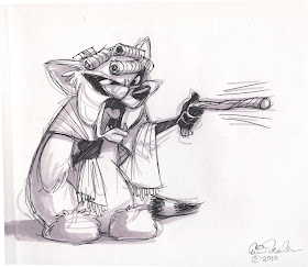
Anyway, to tie this all in to my artwork for today, Chris Sanders directed "How to Train Your Pet Dragon". I haven't seen it (yet!), but was a bit disappointed that from the trailers it didn't look like much of the film bore his design sense, except for the main black dragon, Toothless. Toothless has all of the Sanders earmarks, large slanted eyes, round head, bulbous body and tiny little claws. Anyway, I was doodling in my sketchbook and said to myself, "Self, you should try drawing something like Chris Sanders would draw,".
 I didn't mean to draw a dragon, it just kind happened. And by the time I realized it, I had to make some conscious decisions not to make it look like Toothless. So one part of my brain is working very hard to emulate a style that's not my own and one part is trying to not make it look like a character that's already in my head. If I got anything even resembling a decent drawing is for you to decide. I'm not claiming it's worthy of Chris Sanders, only that it's a homage, so to speak. It's a very itneresting experiment to try to emulate someone who's work you know. You find out how much you know, and how much you don't. I found that I knew the head proportions, and the arms (those are just stitch arms) but how would Chris do a tail? How would he do those little fin things on the side of the head? Anyway, that's pretty much the end of the post. You can go see Chris' stuff now. Take your time and enjoy, but don't stay up too late.


